* All images are by the student
Seriously Funny


Working Vacation
Pretty Ugly
Cheerful Pessimist
This project contributes to the field of product design by illustrating how sensory-focused approaches can transform mundane objects into meaningful interactive experiences, potentially improving focus and productivity in workplace environments. It provides a framework for designing products that cater to diverse sensory needs, including those of individuals with sensory-seeking behaviors.
This research project explores the integration of sensory design principles into workplace equipment, specifically focusing on the redesign of a computer mouse. The study employs a multifaceted methodology, combining phenomenological analysis, semantic interpretation, and semiotic evaluation to investigate the relationship between users and everyday objects.

Figure 1: Moodboard
Exploring Contrast: In nature and Human Cognition
I have always been intrigued by the concept of polarity and its manifestation across various facets of our lives. Polarity, the existence of two opposing tendencies within an entity, is a fundamental concept in human cognition and experience. As Wilber (1979) notes, humans create meaning by establishing mental boundaries that generate pairs of opposites. He states, "In seeking to experience the positive and eliminate the negative, we forget that the positive is defined only in terms of the negative."
The interdependence of opposites is crucial for their existence and definition (Perls, Hefferline, & Goodman, p. 43). For example, our understanding of darkness is contingent upon our experience of light, and vice versa. This interplay of opposites is a ubiquitous phenomenon in life (Polster & Polster, p. 61).

Dark
Light
The next step in the project was to determine how these theoretical investigations be translated into tangible design elements. In design, this concept of polarity manifests through material and colour contrasts. During this investigation, I examined how we understand a “rough” texture because we know how “smooth” texture feels and vice versa. This underscores the fact that our minds process contrasts in both material and colour characteristics, which are crucial components in the design. Moreover, materials evoke specific meanings based on their context, texture, appearance, and cultural associations, influencing our perception of objects as modern, traditional, casual, or professional.
User Survey and Analysis


Figure 2: Participant interacting with concrete sample during the survey
Figure 3: Participants during the survey
Figure 4: Participant interacting with metal sample during the survey
To select materials and colours for my project, I conducted a survey to understand how users perceive contrasting materials and colours. This helped me identify combinations that users found highly contrasting, ultimately informing my design decisions and ensuring a unique user experience. Twenty-six design students participated in the survey, engaging with material swatches to assess their tactile properties and preferences for specific adjectives inspired by a study on Tactile Perceptual Dimensions (Sakamoto and Watanabe, 2017). Adjectives were divided into two sets: one describing material properties (e.g., Rough-Smooth) and the other using general descriptors (e.g., calm-excited). The materials ranged from concrete to textiles, metals, and wood. Figures 12-15 illustrate the material choices and participant interactions. To streamline data collection, the survey was digitized using Google Forms, with examples of the colour evaluation process shown in Figures 17 & 18.


Figure 5: List of material samples in the survey
Figure 6: List of colour samples in the survey
Figure 7: Participant interacting with wood samples

Figure 8: Participant interacting with plastic samples
Phenomenology: This methodology focuses on understanding the essence of lived experiences from the participants' perspectives. For example, the survey revealed that participants often associated wood with positive feelings such as "good" and "calm," while describing plastic as "ordinary" and “bad” as shown in figures 10 & 11. This demonstrates how material qualities can deeply influence emotional responses.

Figure 9: Participant interacting with metal samples during the survey
Semantics: This approach explores how meaning is attributed to materials through language and interpretation. The survey found that participants frequently linked metal with "intellectual" and "serious" qualities, similar to grey, which was seen as "intellectual" and “refined” as seen in figures 10 and 11. This insight highlights how cultural context influences the perception of materials and colours.


Figure 10: Pairs of opposite material combinations derived from the survey
Figure 11: Pairs of opposite colour combinations derived from the survey
Figure 10 illustrates the material combinations identified based on the survey findings. The approach ensured that the selected materials embodied significant opposing qualities, thereby enhancing the project's exploration of sensory and perceptual polarity.
There is a noticeable trend towards the bright pink colour, which was frequently selected by the majority of users for the words "feminine," "playful," and “excited." This indicates that bright pink makes people feel lively and energised.
On the other hand, grey became the preferred colour for being "intellectual" and "refined." This implies that grey is associated with seriousness and sophistication. The colour choices convey a shared language and demonstrate how we connect specific colours with particular concepts and emotions.
Product Selection: Rationale behind choosing a Computer Mouse
After conducting a comprehensive analysis of the survey results, I formulated a framework for discerning the most suitable product for implementing the gathered insights related to the element of contrast. Taking into consideration the needs of the specified users and the product attributes identified through the methodologies employed, the characteristics mentioned below are the most fitting for the comprehending contrasts in a product.

Having thoroughly examined the element of contrast, the focus shifted to incorporating the elements of movement and play. Taking into account these keywords and the previously identified product characteristics, it was determined that designing a computer mouse would best reflect the research, as the user experience of a mouse inherently encompasses the elements of play and movement.

Contrast: It is a major design objective to enable users to simultaneously experience opposite material characteristics in the form of contrasting sensory inputs. The second reason is that when there is a combination of contrasting materials in a single set, it draws attention to the unique characteristics of each material. The contrast between these materials and colours clarifies their individual features. Because we can compare “rough" and "smooth," we become more aware of both of them. The aforementioned concepts can be extended to a computer mouse as it features two distinct clickers, each of which can represent opposing elements.

Figure 12: Illustration showcasing polarity (CMF) in a mouse
Movement: Using a computer mouse involves dynamic user engagement, as the hand and arm continuously embody movement to navigate digital spaces. This engagement requires a synergy between the user’s visual perception and motor skills. As users physically move the mouse across a surface, they engage in a continuous feedback loop, where visual responses on the screen inform further movements, creating a seamless interaction between the physical and digital realms.
Figure 13: Illustration showcasing the movement in a mouse
Play: With buttons, a scroll wheel, and sometimes additional features like side buttons or adjustable weights, a mouse provides multiple forms of interaction, each capable of accommodating different fidgeting preferences. Through these features, users can engage in repetitive actions like clicking or scrolling, which are common fidgeting behaviours that help some individuals concentrate or relieve stress.


Figure 14: Illustration showcasing play in a mouse
Figure 15: Project model for sensory regulation
The developed model can be utilized for various design interventions and it incorporates the necessary components for designing for a sensory-seeking audience during work. With the framework now in place, the next phase of the project involved refining the product concept and aligning it with the theoretical exploration to the best extent possible.
Ideation


Figure 16: Sketches for the form of the mouse


Figure 17: Ideation sketches of the final design
Figure 18: Final Design Tech Sheet
Figure 19: Interior diagram of the mouse with electrical parts


Figure 20: Colour board
Figure 21: Material board

Figure 22: Making processes

Figure 23: User testing video
Product Range
Pretty Ugly
The first mouse in the range combines the rugged texture of concrete with the luxurious, comforting softness of fur. The deliberate choice of concrete brings about a sense of coldness and resilience, while also highlighting discomfort with its rough, unforgiving texture. On the other hand, the fur provides a welcoming and soothing tactile experience, offering a stark contrast to the harshness of the concrete. This unique combination aims to challenge users’ sensory perceptions, providing a profound phenomenological experience that compels them to interact with the mouse in a new and thoughtful manner.
In terms of colours, the striking contrast between the vivid, almost shocking pink of the concrete and the deep, calming black of the fur further accentuates the sensory duality of the design. The vibrant pink of the concrete disrupts the cosy ambience suggested by the black fur, resulting in a visual and tactile experience that is both startling and thought-provoking. More than just a functional object, this mouse serves as a captivating conversation piece that subverts expectations and evokes a rich sensory experience.

Figure 24: Mouse 1: Pretty Ugly (named similarly to the project, oxymoronic)

Working Vacation
Materials: The mouse seamlessly blends the organic, tactile feel of wood with the pliable, precise nature of clay polymer. The wood's natural, warm texture imparts a sense of calm, grounding and a direct connection to nature, elevating the mouse from a typical mass-produced product to a finely crafted object. In contrast, the yellow clay polymer introduces an element of customization and exactness, enabling the creation of a sleek, sculpted form that juxtaposes the wood's more irregular grain. This amalgamation aims to craft a sensory experience that is both organic and artisanal, effectively blurring the boundaries between nature and technology.
Colours: The colour scheme for this mouse mirrors its material composition, with the wood's natural tones—ranging from rich browns to lighter, more neutral shades—complementing the vibrant yellow of the clay polymer. The polymer's lively yellow hue can either harmonize with the earthy wood tones creates a bold and innovative aesthetic by providing a stark contrast. This mouse delves into the interplay between natural materials and human-made precision, presenting users with a tactile encounter that feels both invitingly familiar and refreshingly contemporary.
Figure 25: Mouse 2: Working Vacation

Cheerful Pessimist
Materials: The striped sandblasted metal in the third mouse brings a rugged, robust texture to the mouse, giving it an industrial and utilitarian feel. Its rough and abrasive finish exudes durability and seriousness, grounding the design in functionality. In contrast, the neon acrylic introduces a playful and smooth surface to the mouse, creating a whimsical and almost lighthearted element. This deliberate contrast aims to embody the duality of modern design, seamlessly blending functionality with fun, and seriousness with playfulness.
Colours: The colour scheme of this mouse plays a pivotal role in reinforcing this duality. The grey of the metal exudes an industrial coolness and seriousness, setting a stark contrast to the unexpected energy and cheer brought forth by the neon yellow acrylic. The juxtaposition of these colours creates a captivating visual tension that mirrors the material contrasts, making the design not only engaging but also thought-provoking. Ultimately, the mouse invites users to explore the harmonious coexistence of the serious and the playful within a single object.
Figure 26: Mouse 3: Cheerful Pessimist
Product Gallery


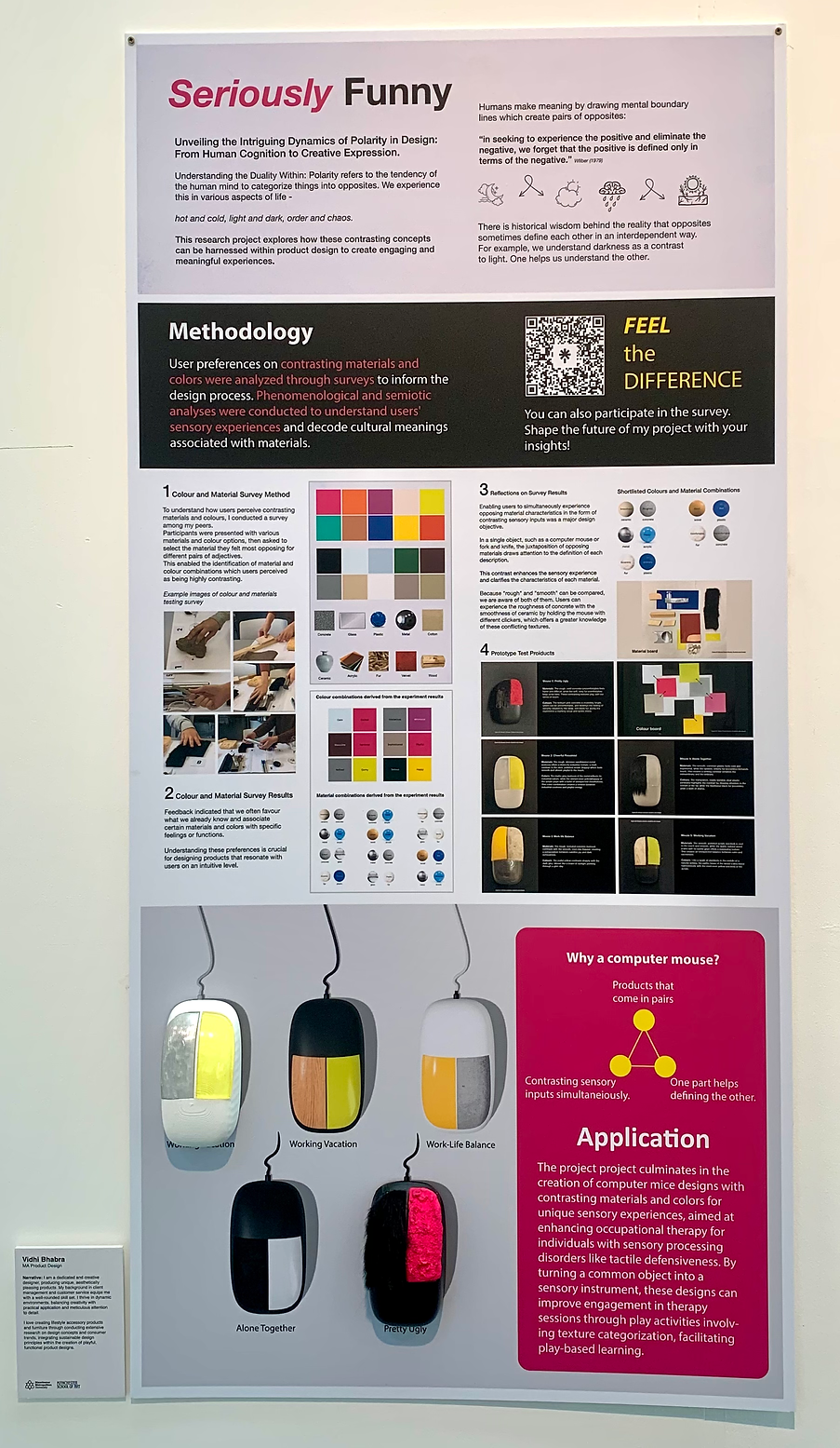


Figure 28: Attendee interacting with the mouse prototype at New Designers
Figure 27: Project DIsplayed at New Designers Exhibition, London
Figure 29: Project displayed at Testing Times Show, MSoA